 28 Feb 2024
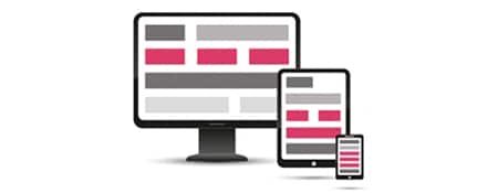
A responsive website, you can either code it yourself or have it coded by a programmer/designer.
Why not use plugins?
There are various plugins that can turn your WordPress website into a mobile version, adapting the layout to fit tablets, smartphones, or wide monitors.
Every plugin you use is a potential security risk.
If you create a mobile site with plugins, such as a scaling plugin, a responsive menu plugin, a widgets plugin, an image resize plugin, etc., you might end up using 3-4 plugins just to display a mobile version to your visitors.
Moreover, the website might become slower and less secure, and it could have a completely different appearance, providing a different user experience for desktop visitors compared to what they experienced on their desktop devices.
Creating a responsive website without plugins
As a programmer, you can create a mobile site by using the existing elements of the site and providing customized formats based on screen width through a custom stylesheet (CSS).
If you don’t know how to start coding a mobile version, you can follow the tutorial below: “How to start coding a mobile version.”
If you are not a programmer, you can hire a programmer with experience in converting WordPress websites to mobile formats.
How to start coding a mobile version
The viewport
Easily forgotten, but very important! The viewport ensures that your media query knows the width of the screen.
<meta name="viewport" content="width=device-width, user-scalable=no">
This viewport meta tag can control the size that should be displayed for the whole device/CSS.
We have media queries
Where you can specify what to do with Divs, titles, paragraphs based on the screen size.
@media screen and (min-width: 600px) and (max-width: 900px) {

/* Your CSS here */

}
Everything you put between that media query for 600 to 900 pixels will be displayed at that screen size.
Don’t forget to close the query!
Extra clarification: If you already have CSS code with !important in your regular stylesheet, you will need to overwrite it with !important or remove the “importance” from your regular CSS. Otherwise, the element won’t be affected.
Does the media query work? Test to know!
You might add code for a specific size, but nothing happens. Make sure the CSS is actually being used for a particular size.
What I often do is first write some code that changes the background color of the entire body for a certain size.
For example:
@media screen and (min-width: 600px) and (max-width: 900px) {

body { background-color: red !important; }

}
Then you can view the website on your mobile device, tablet, or scale the screen in your browser and see if the background turns red between 600 and 900 pixels.
Fluid versus Fixed
Opinions vary widely on the choice between Fluid or Fixed, so just do what you find most convenient.
Explanation of Fluid and Fixed:
Fluid means setting the wrappers (outer divs) to 100%. It scales with the maximum possible width of your device.
This allows you to use the maximum width, but the downside is that each device has its own width.
Fixed means a fixed value. In this case, you determine the width of each wrapper per media query.
How do I determine the flexible widths?
This can also be done in various ways. For example, from 1000px, from 750 to 1000px, and from 250 to 750px.
Think of 1000+ as for computers, 750 to 1000 for tablets in landscape mode, and 250 to 750 for tablets in portrait mode and phones in landscape mode.
Note! These pixel widths may change yearly as tablets become sharper, and it becomes pixel-specific.
This was the starting point for creating a responsive website without plugins!
The important thing is that it is relatively easy to achieve without plugins, which provides a better foundation for the speed and security of your WordPress website.